Details Pages Study
Overview & Challenge
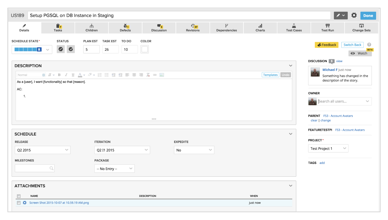
CA Agile Central (formerly known as Rally Software) is a collaborative enterprise SaaS platform for agile software development. Within the platform teams plan, prioritize, and track their work. All work item types and artifacts created have their own detail page.
There were 23 detail pages across the platform that had varying tabs dependent on the artifact type, creating inconsistencies. Some of these detail pages were available in a beta version referred to as editable detail pages (EDPs). EDPs were written in a newer, though less performant, tech.
EDPs never reached the retention rate that would move them past the beta stage, and were planned to be rebuilt in a more performant tech. This was an opportunity to revisit both detail pages and EDPs to improve consistency, design, and usability.
Details
Research
The following were the steps that we took to collect data around all detail pages:
- Gathered relevant information from 2 studies conducted on earlier EDP iterations
- Took inventory of detail pages and recorded their tabs, fields, & if they were available as a beta EDP
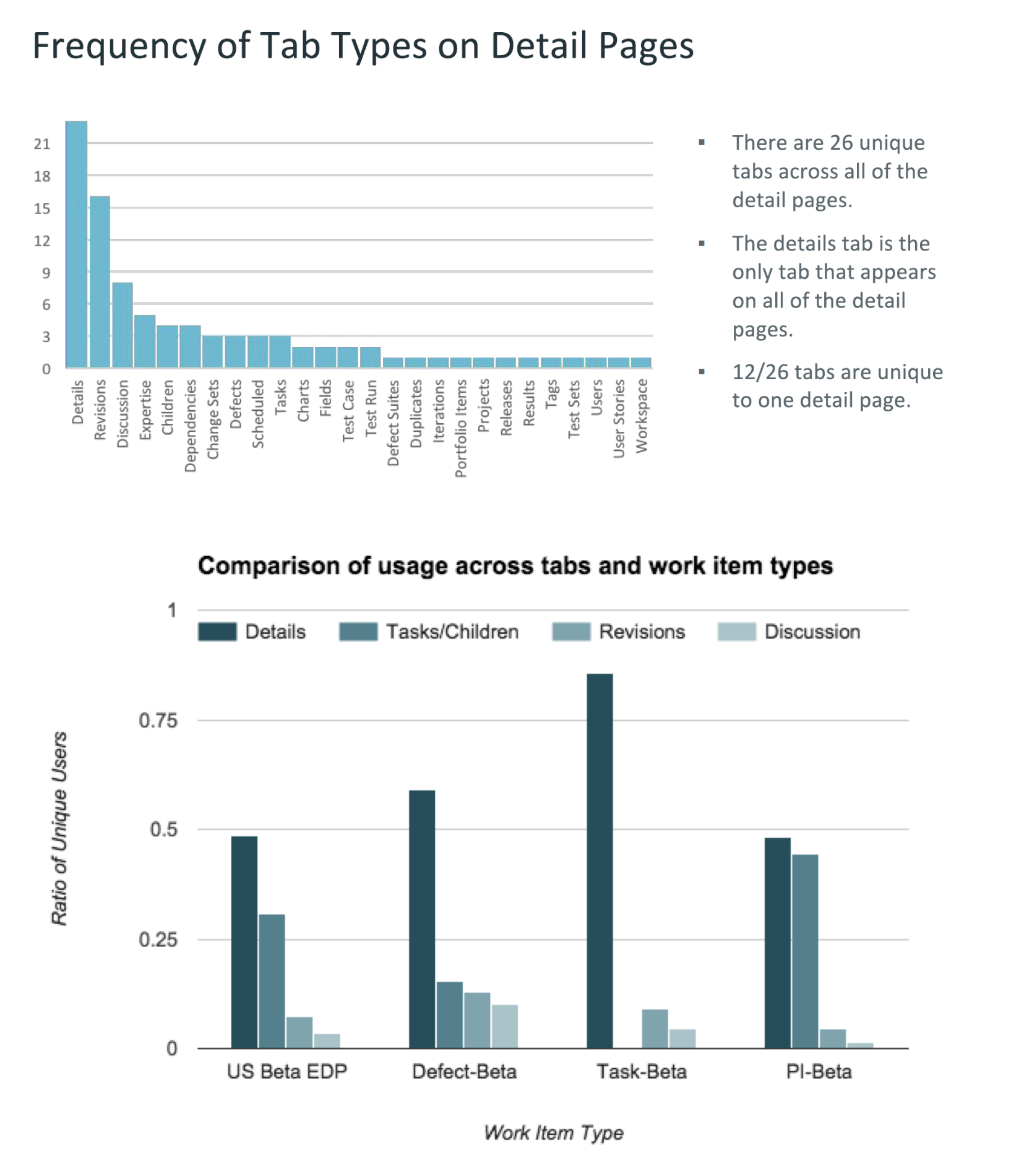
- Collected tab usage data from Splunk and charted patterns across pages
The top takeaways from the collected data were:
- 13 out of the 23 detail pages were not available as a beta EDP
- There were 26 total tabs across the 23 detail pages
- The details tab was the only consistent tab across all detail pages
- 12 out of the 26 tabs were unique to one detail page
User Interviews on Usage & Behavior
Speaking with customers helped us gain more insight around tab and field usage.
The key points around field usage were:
- Customers tended to ignore the fields they didn’t use
- Multiple customers wanted the ability to choose the fields they see as they didn’t use most of the fields
- Multiple customers voiced a desire to see the description while creating or managing tasks
- Notes had little usage due to customers using the discussions tab as a note system instead
The key points around tab usage were:
- Tasks/Children was the most used tab
- Defect tab usage was dependent on the organization, some customers didn’t track defects
- Rare usage of charts, test sets, test cases, test run, and change sets tabs
Tab Organization Scheme
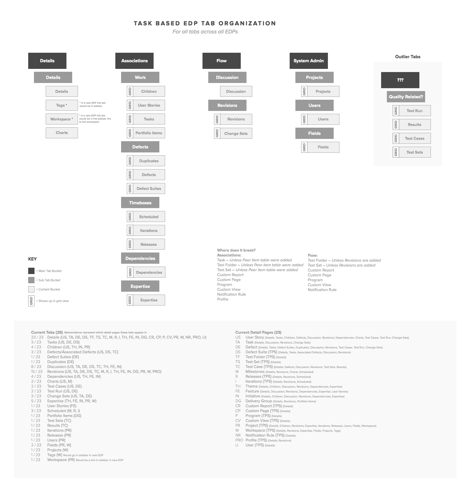
The discovery of the abundance of tabs led to setting a goal to eliminate, or at the very least decrease the number of tabs in detail pages. In the interim, the existing tabs would be distributed across a small set of top level tabs that would be consistent across all detail pages. This would significantly minimize the user’s cognitive load. After creating many possible organization schemes, a task based scheme worked best with the type of content.
Sketching & Wireframing
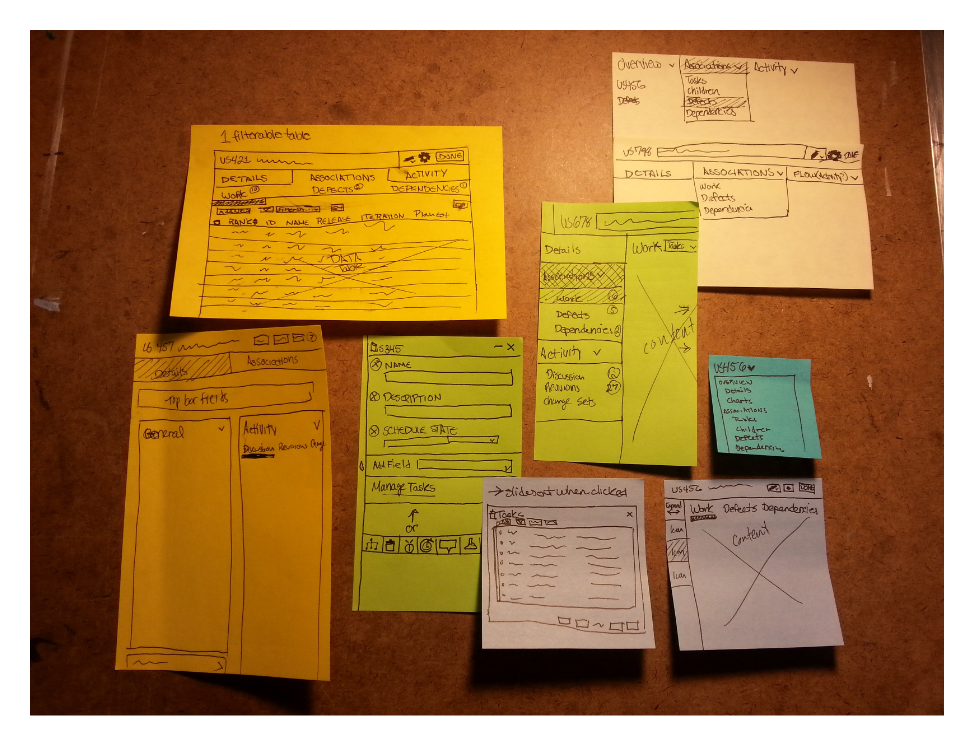
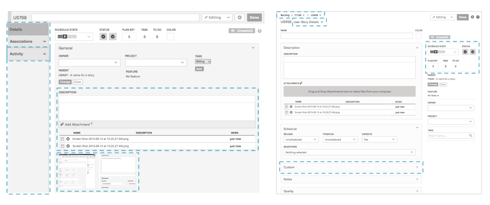
The task based tab organization scheme was used as a base structure that we built upon through layout sketches. We iterated on feedback given to us by team members and ultimately decided on 2 versions to test.
The first version was a nested navigation in a side menu bar and the other was a dropdown menu style navigation with tabs nested inside categories within the dropdown menu.
Tab Organization Scheme Usability Testing
We recruited customers and walked them through a series of scenarios with both the side menu bar version and the dropdown menu version.
Side Menu Bar (V1)
The top takeaways from testing the side menu bar were:
- There were concerns around the sidebar being a poor use of screen real-estate
- Activity was meant to refer to where the discussion and revisions tabs would be, but more often it was interpreted as where work items would be
- There were concerns around the discoverability of attachments if the section were to be moved too far down in the field hierarchy
- Users were indifferent about attachment previews
Dropdown Menu (V2)
The top takeaways from testing the dropdown menu were:
- Customers were generally content with schedule related fields being in the sidebar
- The custom fields section was confusing to users, but that was out of the scope of the testing
- The breadcrumbs were interpreted differently than intended, but the way customers were interpreting them was fairly consistent and was liked by most
- Discoverability issues existed around the dropdown menu, but once it was discovered customers liked it
- This version was the clear winner and was described as being cleaner and having a more efficient use of screen real-estate
Iterating On Wireframes
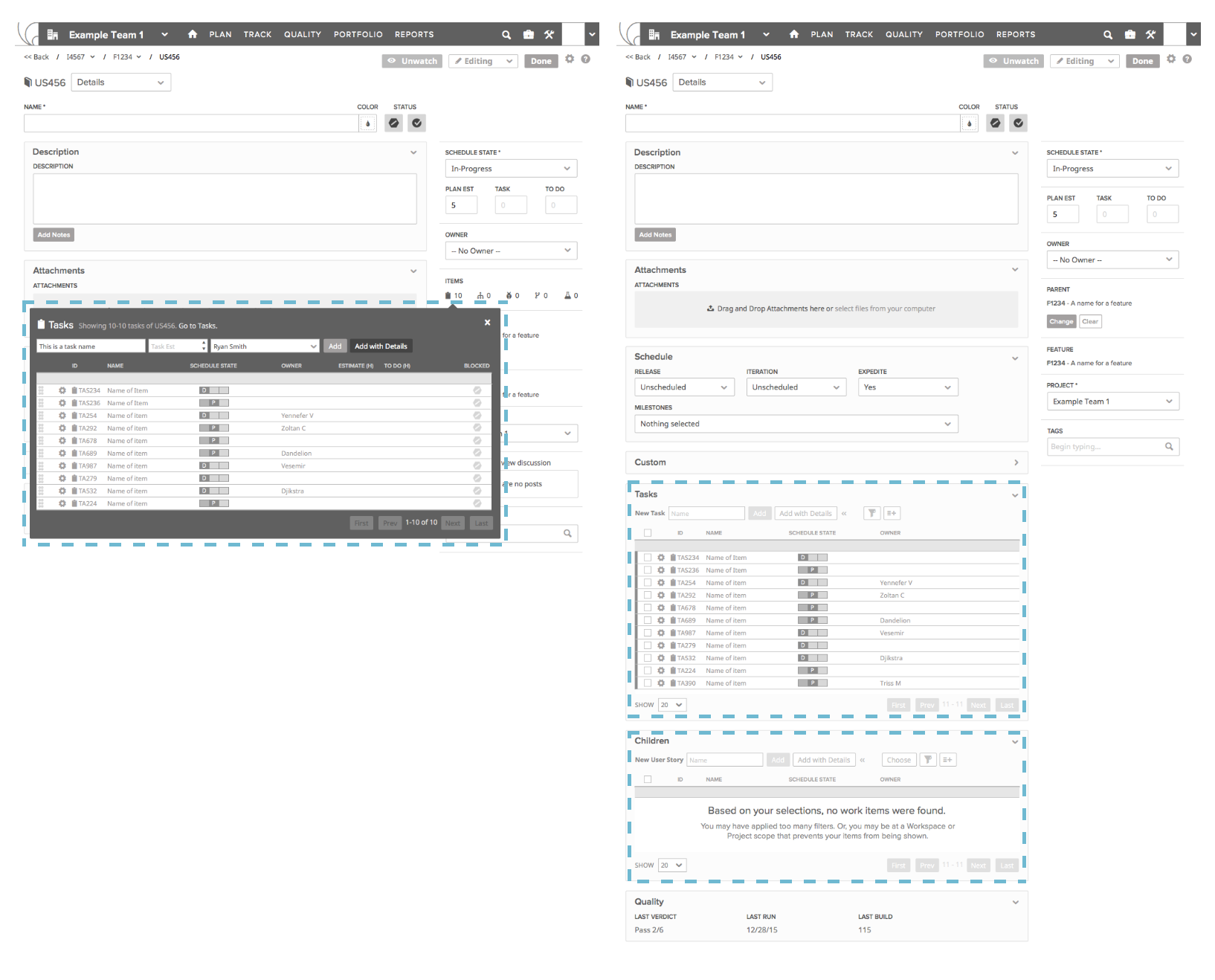
There was a push for the team to focus on eliminating tabs and incorporating their content into the main detail view. After iterating on new wireframes and receiving feedback, we decided on 2 wireframe concepts to test.
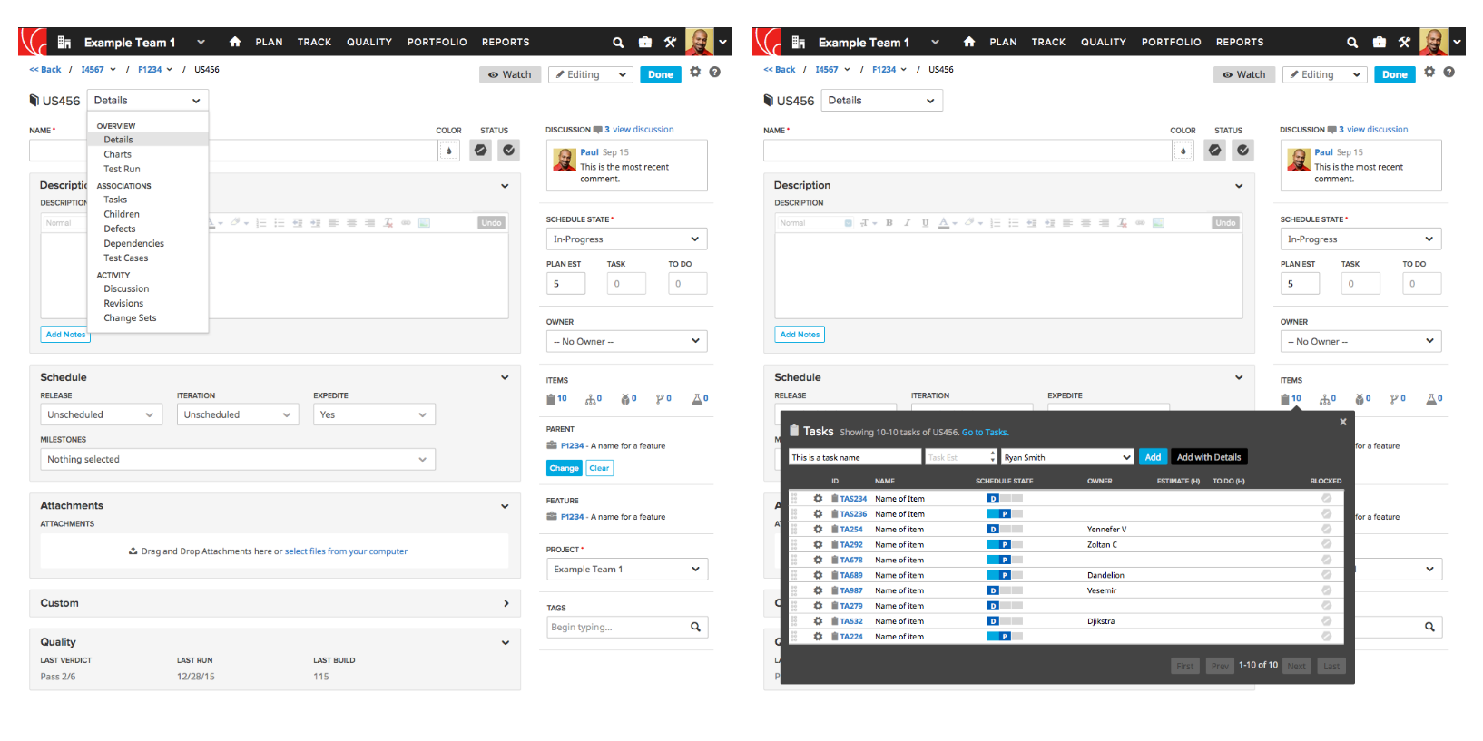
The first version had task and children data tables in the main detail view, while the other version had icons for associated work items on the right side of the page that spawned popover data tables when clicked.
Tab Elimination Usability Testing
We recruited more customers and walked them through scenarios with both the popover and the table wireframes.
Popover (V1)
The top takeaways from testing the popover were:
- The discussions section was moved down to make the popover icons more discoverable, but customers wanted it to be moved back to the top
- There were issues around customers understanding a few of the associated work items icons that were less prevalent in CA Agile Central, but most icons were understood
- Customers liked the ability to manage their tasks in a popover while viewing the work item’s description at the same time
- This one was a clear winner and there weren’t many revisions that needed to be made
Table (V2)
The top takeaways from testing the table were:
- The table felt too busy for many customers
- Some customers wanted to view tasks concurrently with the description and were unable to in this version
- There were performance concerns in the event of a lot of tasks or children existing for the work item being viewed
Final Designs & Status
The popover version tested very well with very few revisions needing to be made. Fellow team members used the findings from this study in the following quarter to aid them with future Quick Detail pages work.
Quick Detail pages aimed to make detail pages simpler, customizable, and easier to use. Our research brought visibility to the most used tabs and the complaints that could surface if Quick Detail pages don’t properly accommodate for customer needs.
