Usability First
Overview & Challenge
Usability First is a resource for those new to usability. It is a massive site with around 70 pages of information and its main competitive advantage is an extensive glossary of nearly 2,000 terms.
The design had gone untouched for 5 years and the information was mostly out-of-date. The architecture of this massive site required a large amount of work as did the outdated navigation structure.
Details
Research
It was crucial that our team assessed the state of Usability First.
- Creating a Google Analytics report gave insight into site traffic, demographics, and popular queries.
- Performing a competitive analysis helped with understanding where Usability First stood in relation to competition.
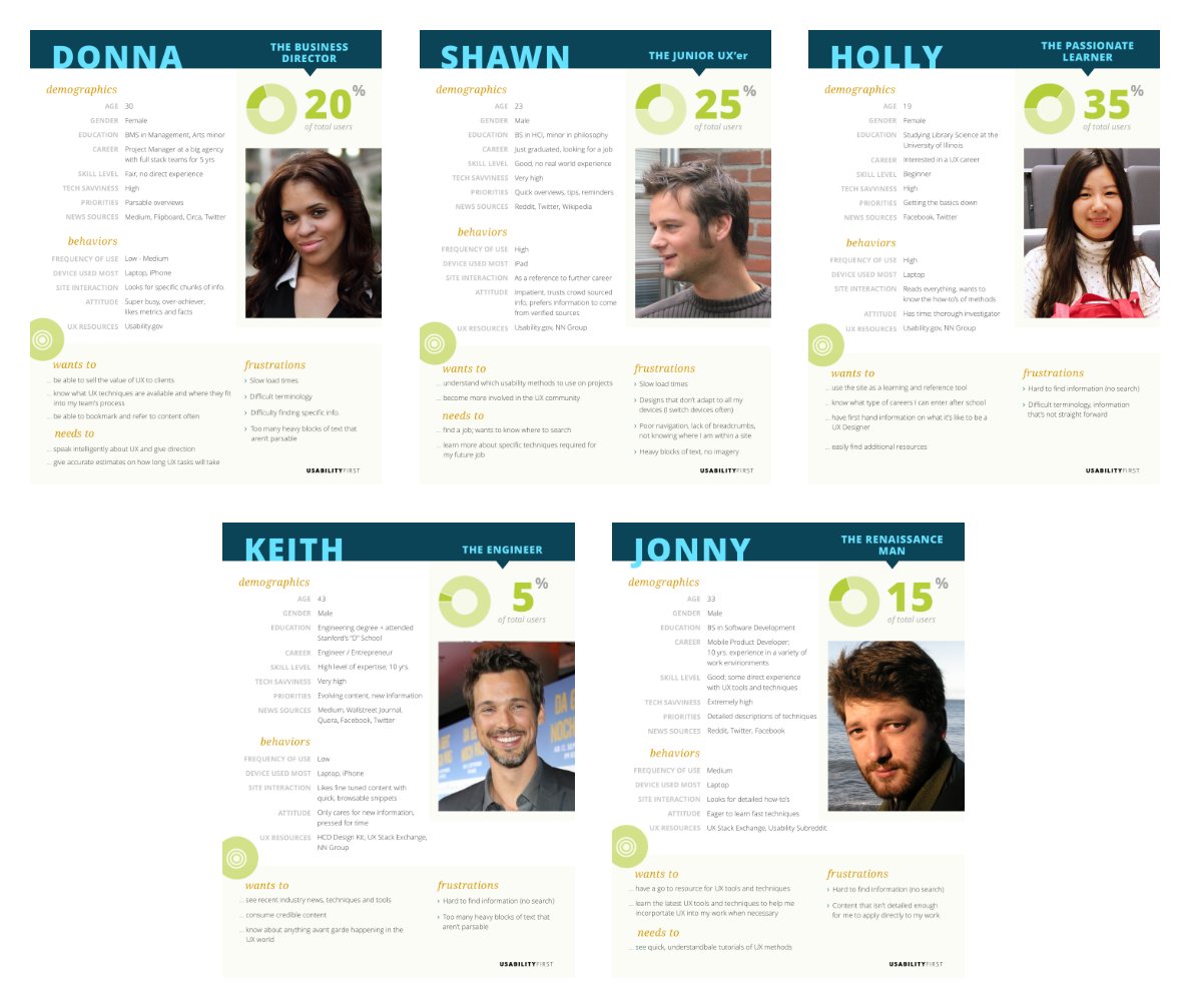
- Personas were created using the information we gained from the analytics and competitive analysis.
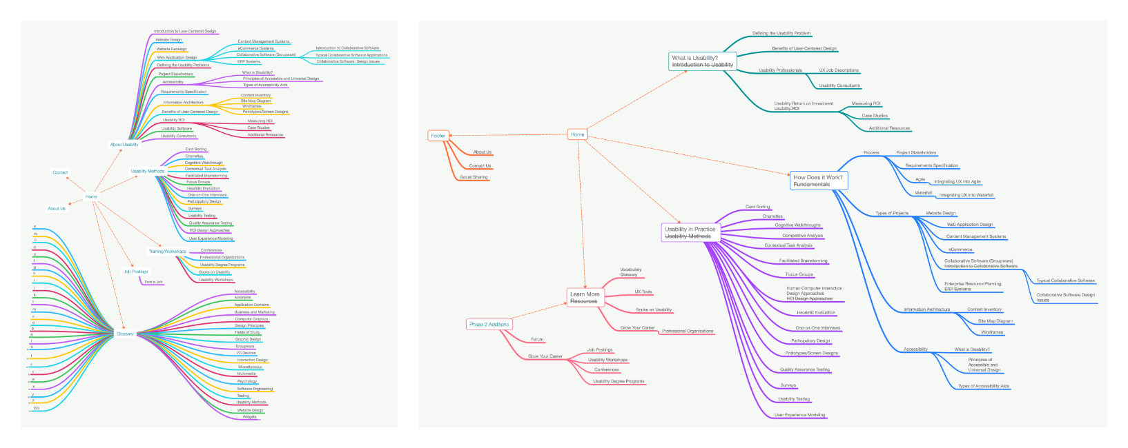
- A sitemap and content inventory were created concurrently to better understand the site volume and content.
Card Sorts, Interviews, & IA
We recruited individuals that fit with the personas that were created and conducted user interviews to gain insight on what users wanted to gain from a usability resource site. Card sorts were conducted in tandem to aid in refreshing the information architecture of the site.
Taking the information gained from the card sort helped with refreshing the IA of Usability First. Our small team sketched ideas around navigation and IA as well.
Style Tiles & Persona Design
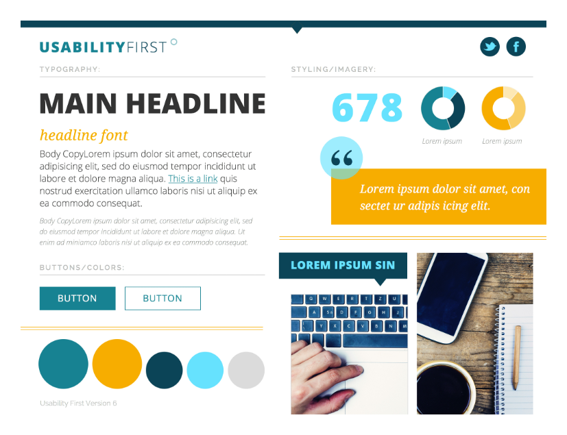
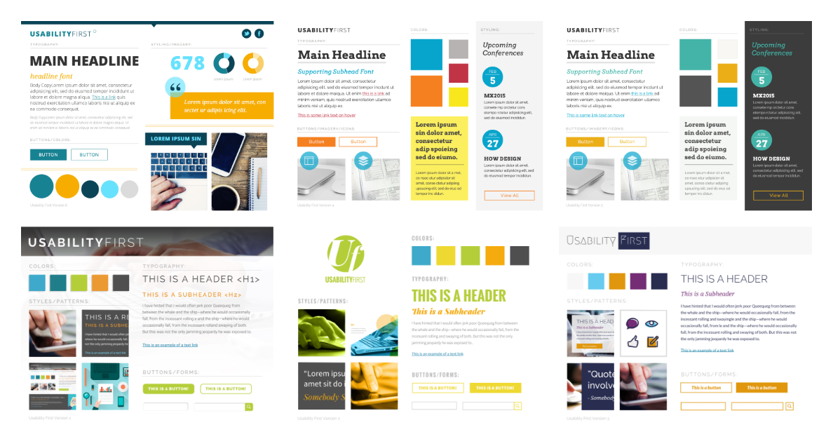
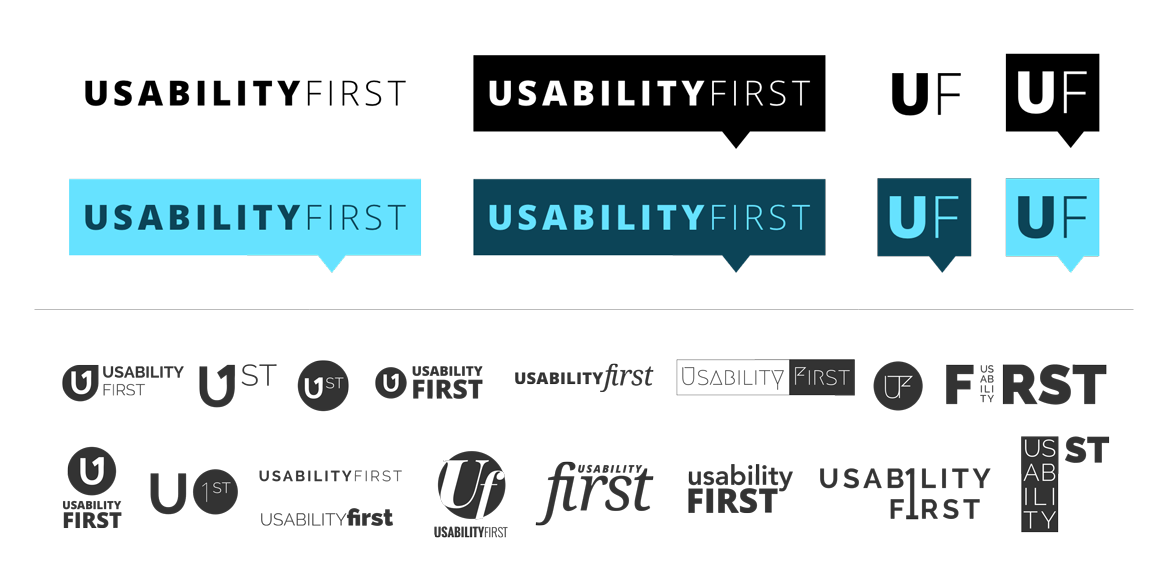
Style tiles were designed to explore different stylistic directions we could take and we narrowed our choices down to one, while retaining some elements from the others. During the creation of style tiles, effort was also being put towards redesigning the logo. Afterwards, visual representations of the personas were designed.
Sketching
The first step we took in the design processwas sketching navigation and interior page structure. Keeping in mind how the navigation and interior page layout would work responsively was crucial.
Multiple iterations of sketching occurred before reaching the design phase where we would apply the style tile design to the layouts.
Interior Page & Navigation Design
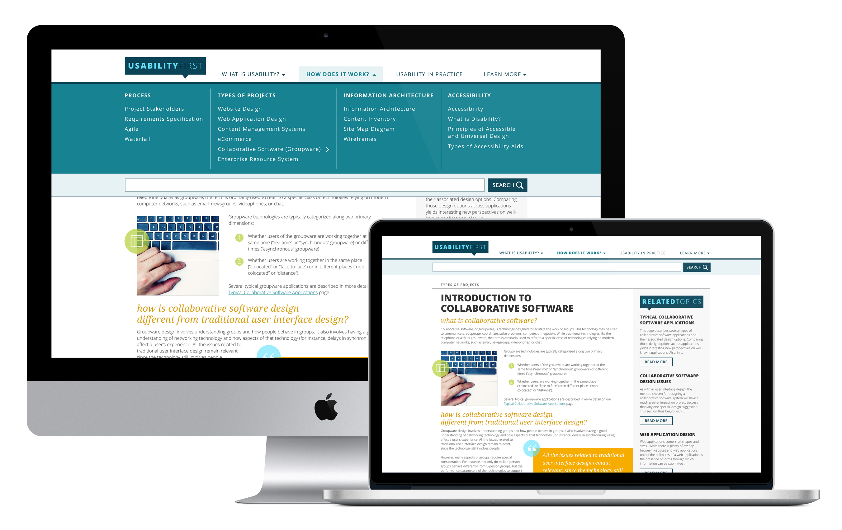
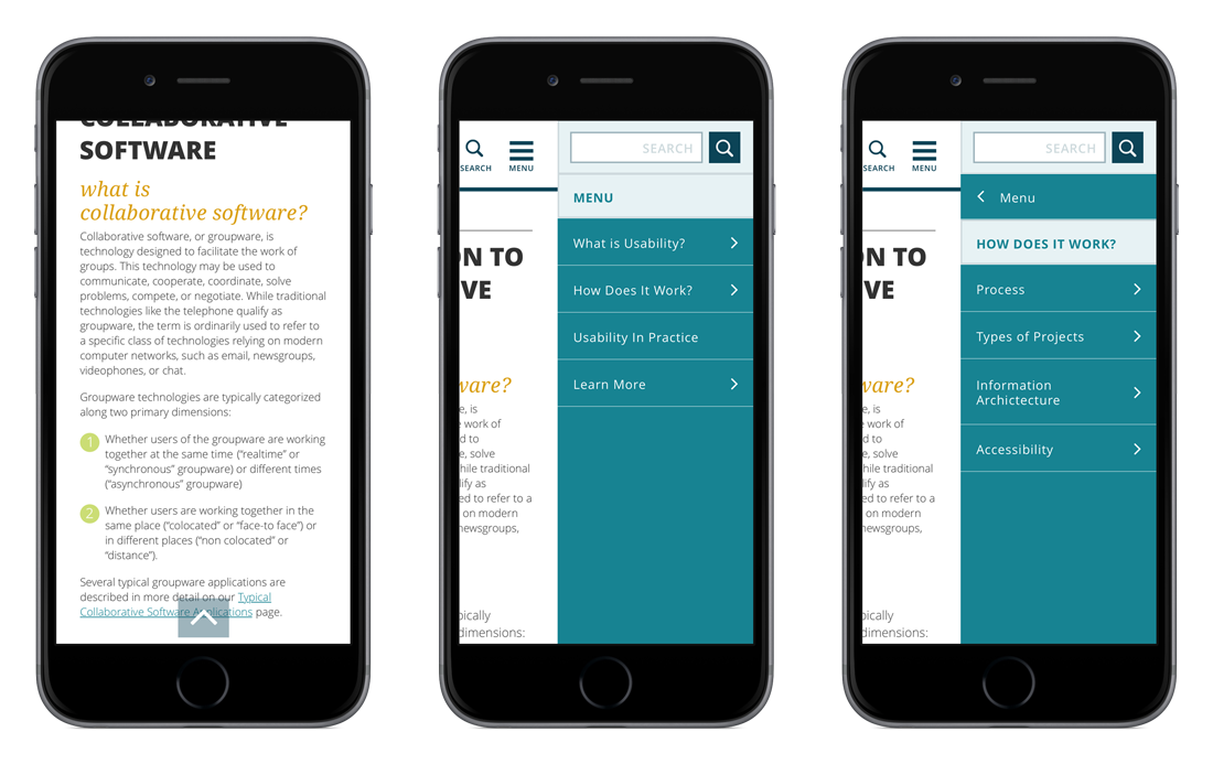
After multiple iterations of sketches, a mega-menu style navigation was decided upon due to the vastness of the site. The mobile version was treated differently with a hierarchical drill down navigation to create a simpler UI.
The interior page design incorporated various visual elements to break up the body copy. Each page had a sidebar of related topics. In mobile format the related topics sidebar would live beneath the main content.
Status
The design of the navigation and interior page were as far as the Usability First refresh project got before priorities shifted the UX team’s focus elsewhere.
